Out With the Old and in With the New
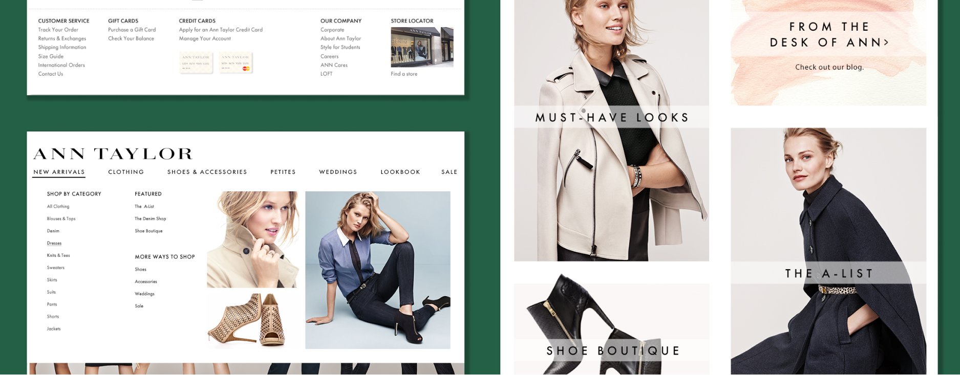
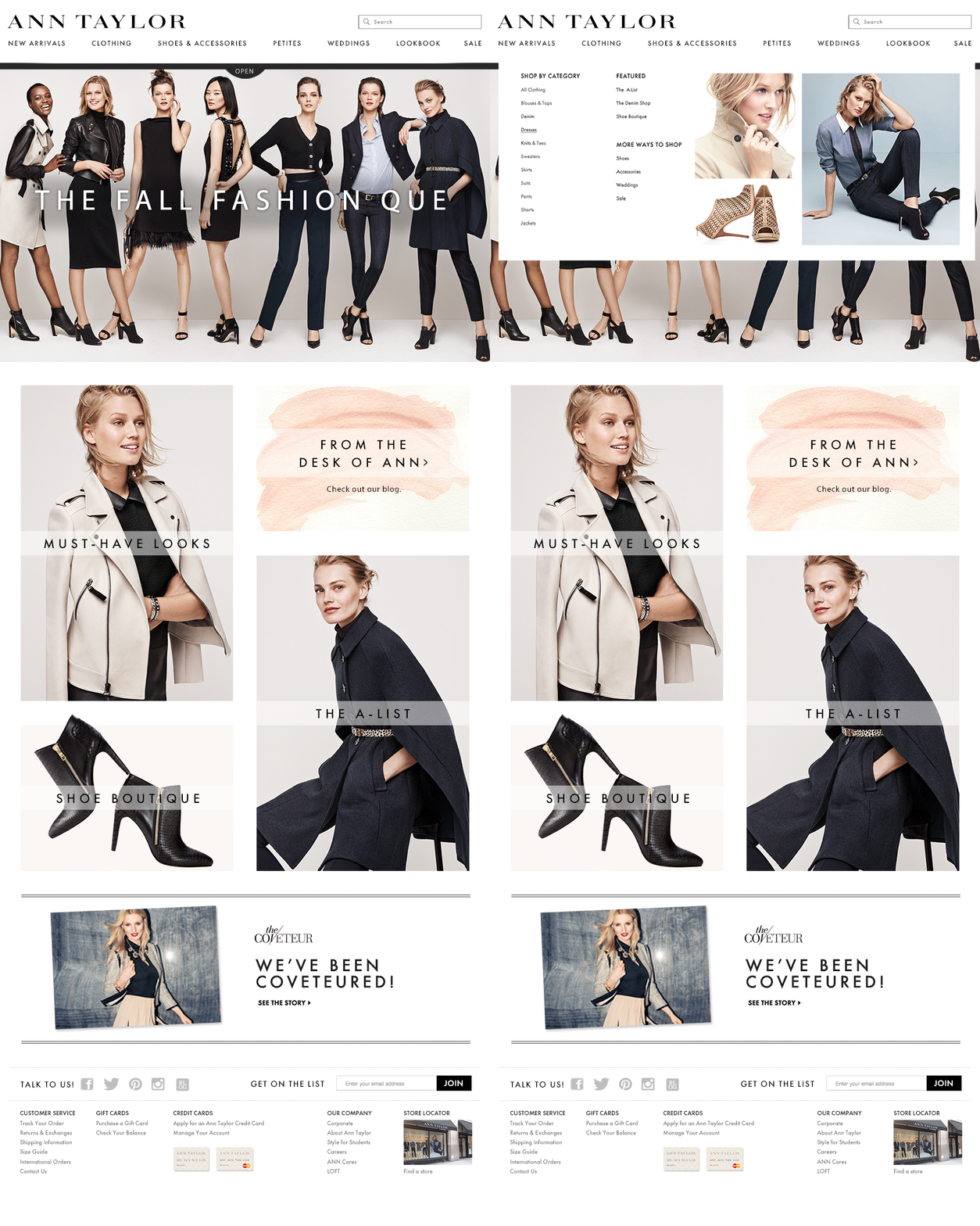
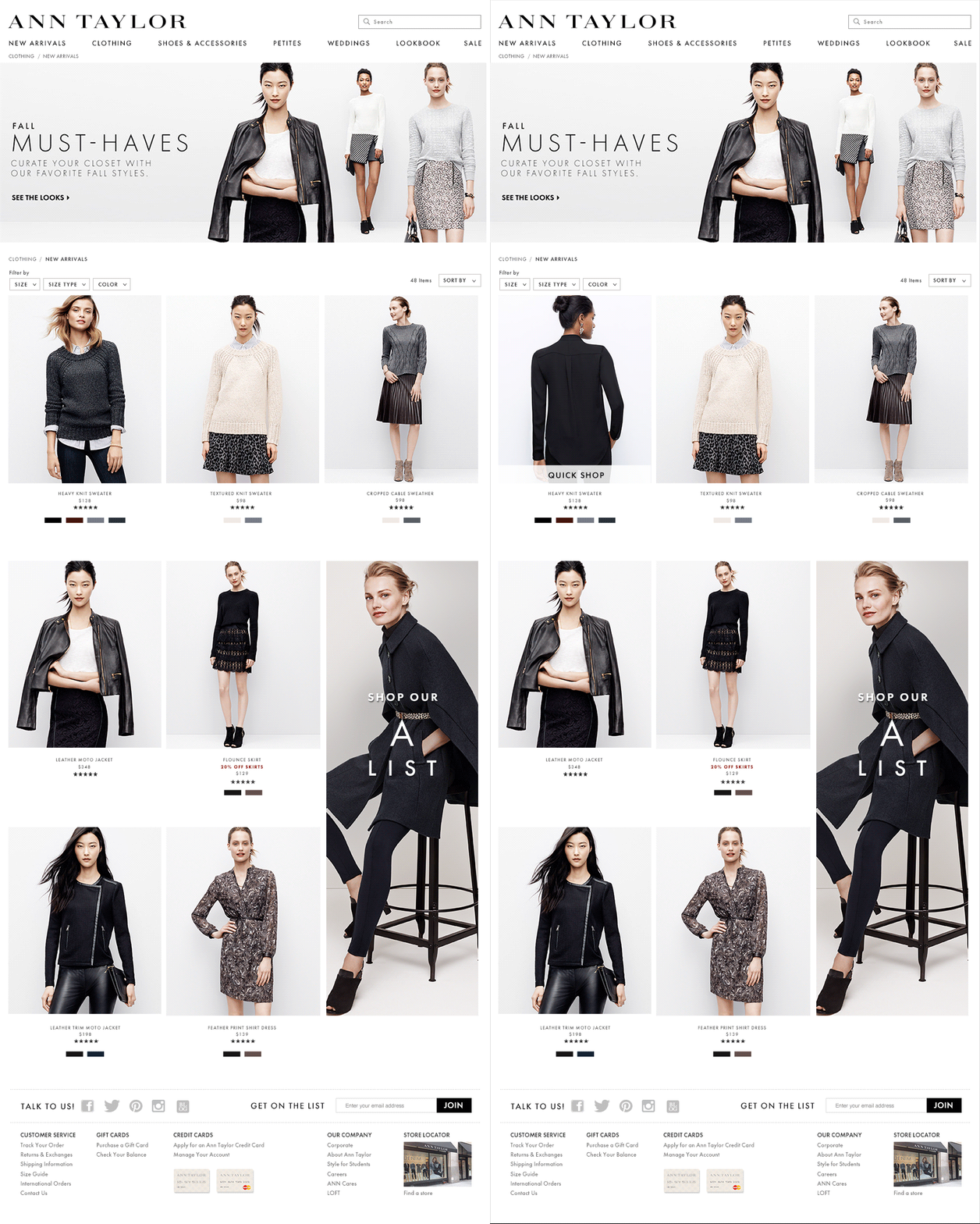
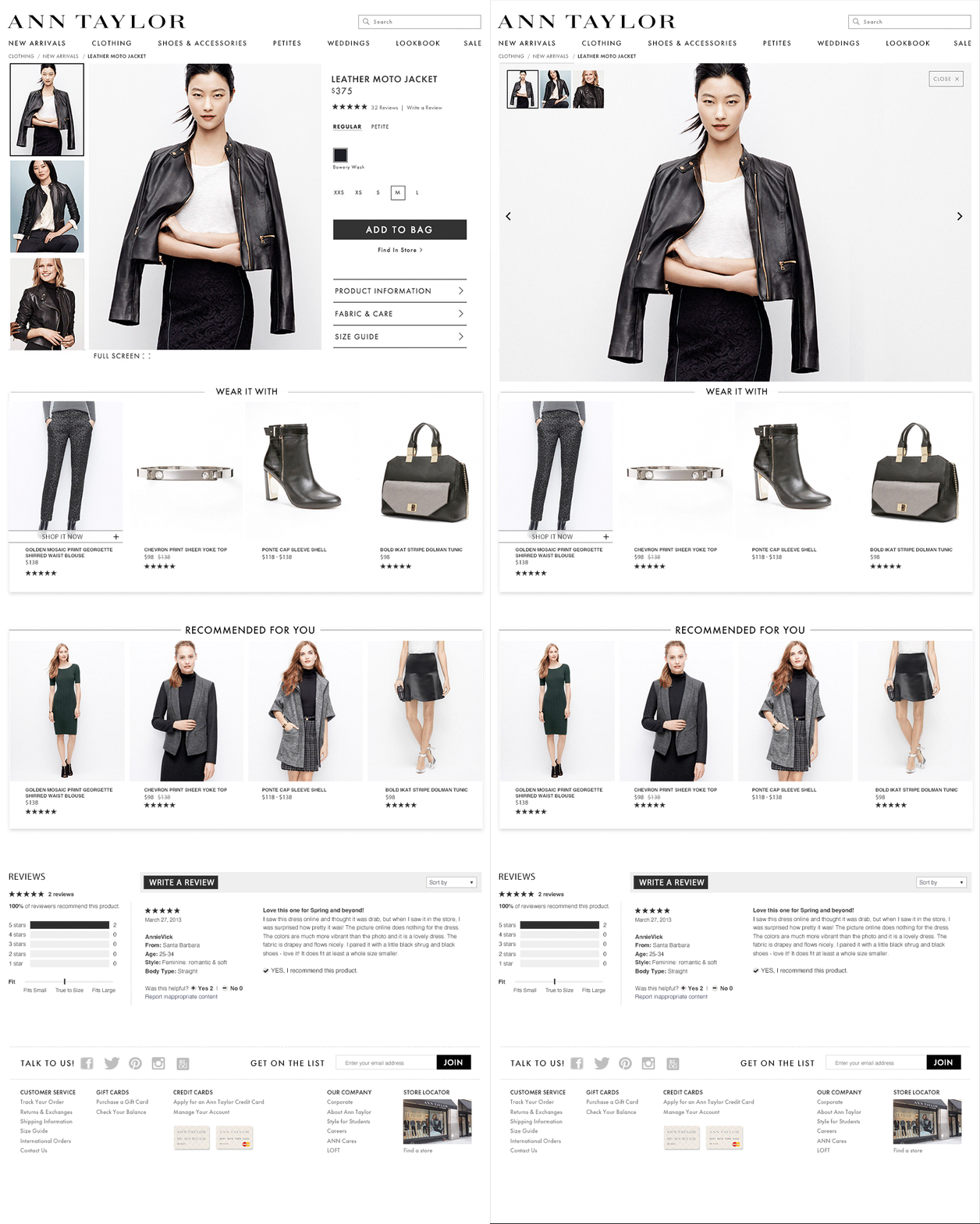
The Ann Taylor websited was outdated and in need of both a visual makeover and an upgrade in functionality. I was the design lead on the redesign and the liaison with external developers on everything from home page and new navigation, through product pages and all the way to cart and checkout. We modernized the look and feel of the site, increased image sizes to give the shopper the ability to view products in detail and provided them with new, quicker ways to shop and checkout which led to increased conversion. We pre-developed carousels, video players and marketing slots that plugged into the site code. This increased consistency across the site and allowed us to more quickly add marketing and editorial content to the site while preserving time and cost.
My Role:
Art Director at Ann Taylor
Designed from the ground up—a new e-commerce website, site navigation, category pages, product detail pages and checkout flow.
The mobile site that was launched ahead of the desktop site and increased revenue by 30%


